Introduction
Timeline. Aug 2020 - Dec 2020
Problem statement. A startup company provides mobile car washing services using environmentally friendly cleaning tools. But due to the pandemic, they faced challenges with their schedule and contactless payments.
Goal. The goal of this project was to design and develop a web-based application that allows customers to book and pay for their car washing.
Team. 2 developers, 2 founders
Roles played. Full-stack programmer
Activities
Getting started
Challenges
Before jumping into business requirements, we needed to choose a hosting service, a technology stack, and an online payment provider.
Proposed solutions
- Hosting provider: We wanted to store client data only in Switzerland. The service should allow for easy hosting of the application for a cheap price. Hostpoint was our chosen one.
- Technology stack: As I started alone on the project, I went for a monolithic web-based solution; I used the Laravel PHP framework with a MariaDB database.
- Online payment provider: After analysis, we found that Datatrans offers locally popular payment methods like Twint and also offers a simple-to-use API and back office application.
Lessons learned
It was overwhelming to analyze all the high-level business needs and experiment with different offers to choose something with confidence. I think this investment is critical, and I learned to never ignore it.
Developing the solution
The application has two types of users: admin and customer. Customers can book, cancel car washing, and manage their cars details. Admins are the car washers; they can see and modify all the bookings. Additionally, they can manage their vacation schedules.
Booking system
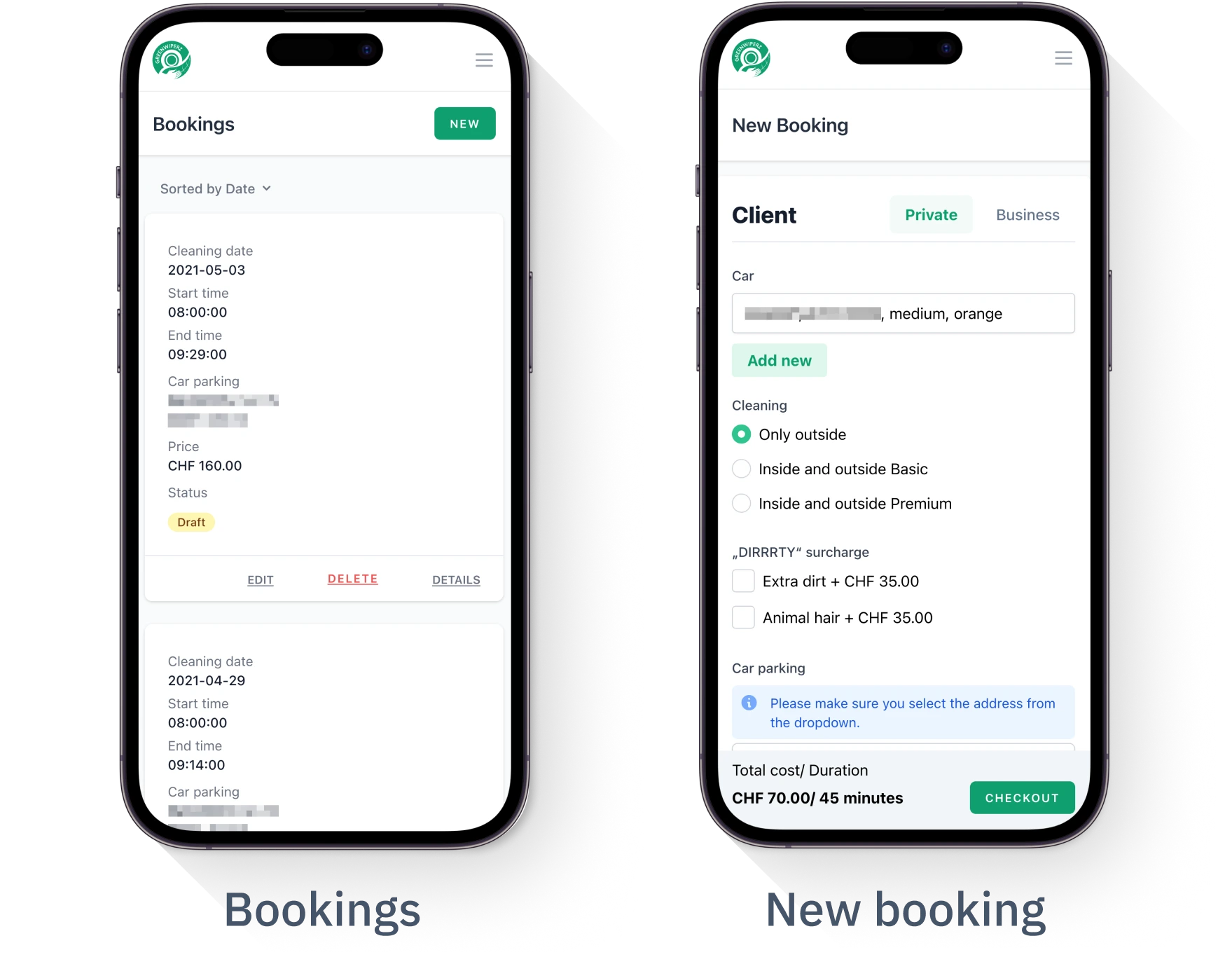
The main feature of this booking system is a form, which allows users to make a booking. In my design process I balanced between simple to use and easy to implement. Therefore, I used native text fields, radio buttons, dropdowns, and checkboxes. I excluded complex cards and not native date pickers.
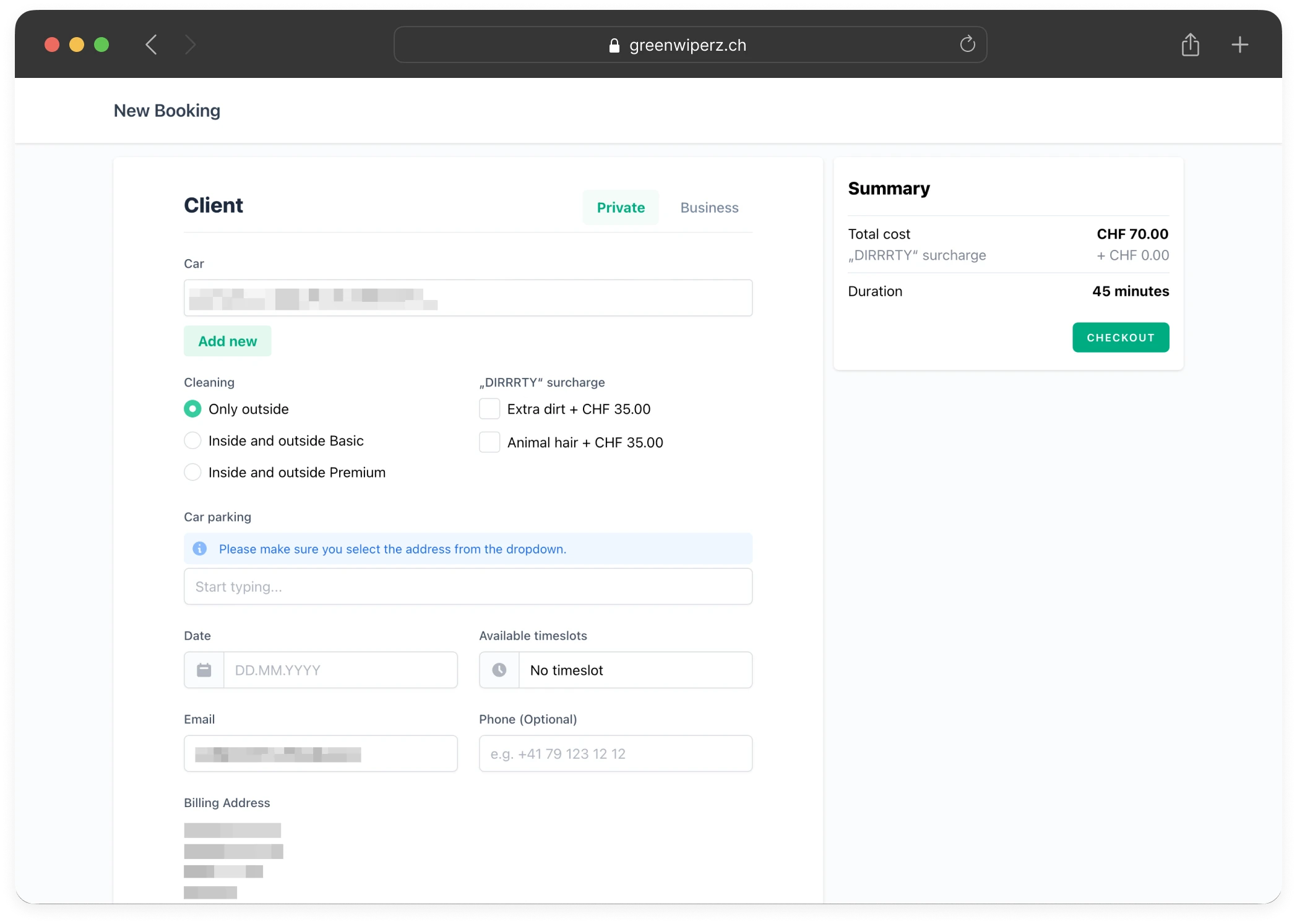
To enter the location of the car, the user starts to type, and a built-in Google Maps dropdown will suggest places. This was a critical feature because this is how the company informs users whether the service is available in that location.
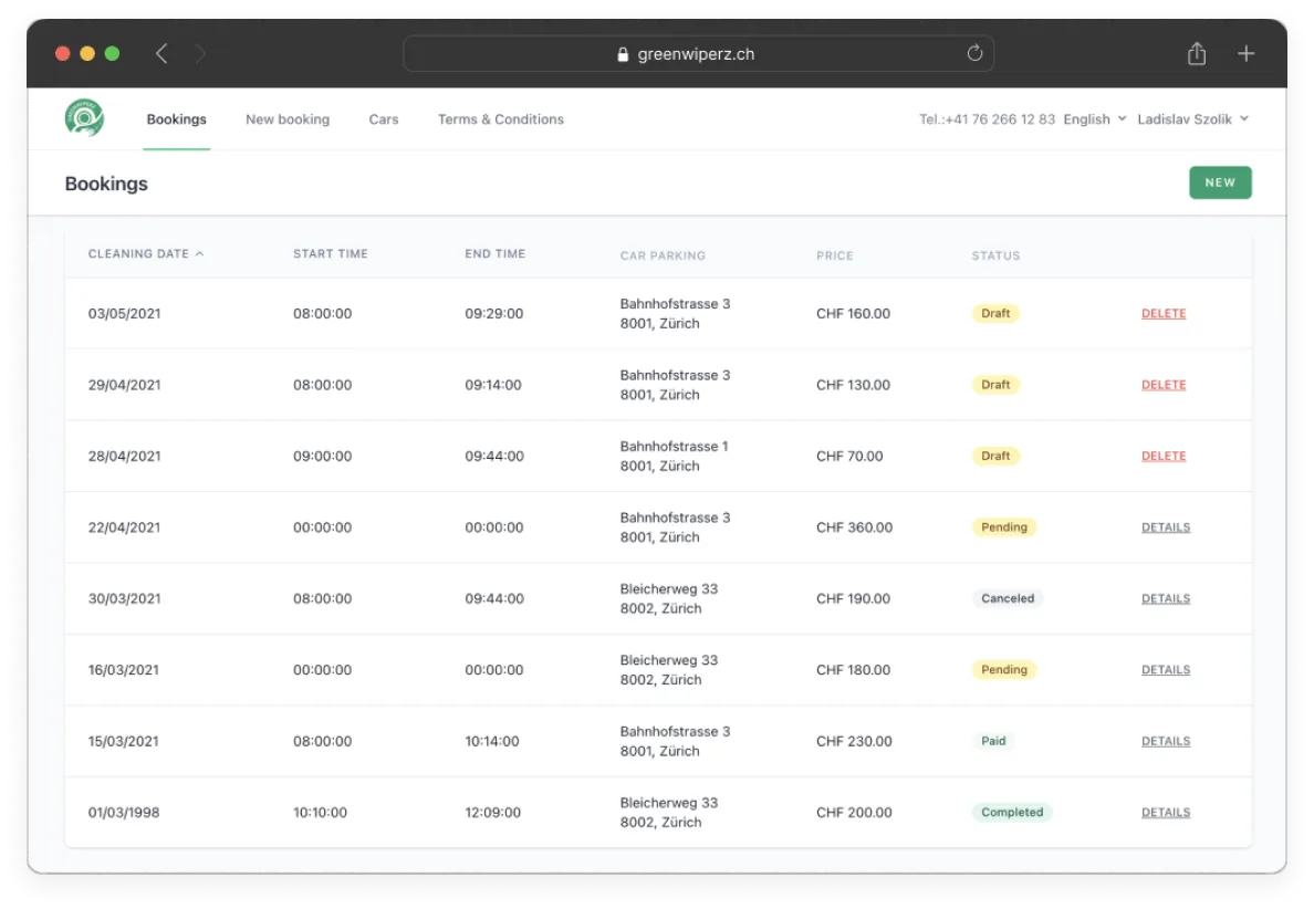
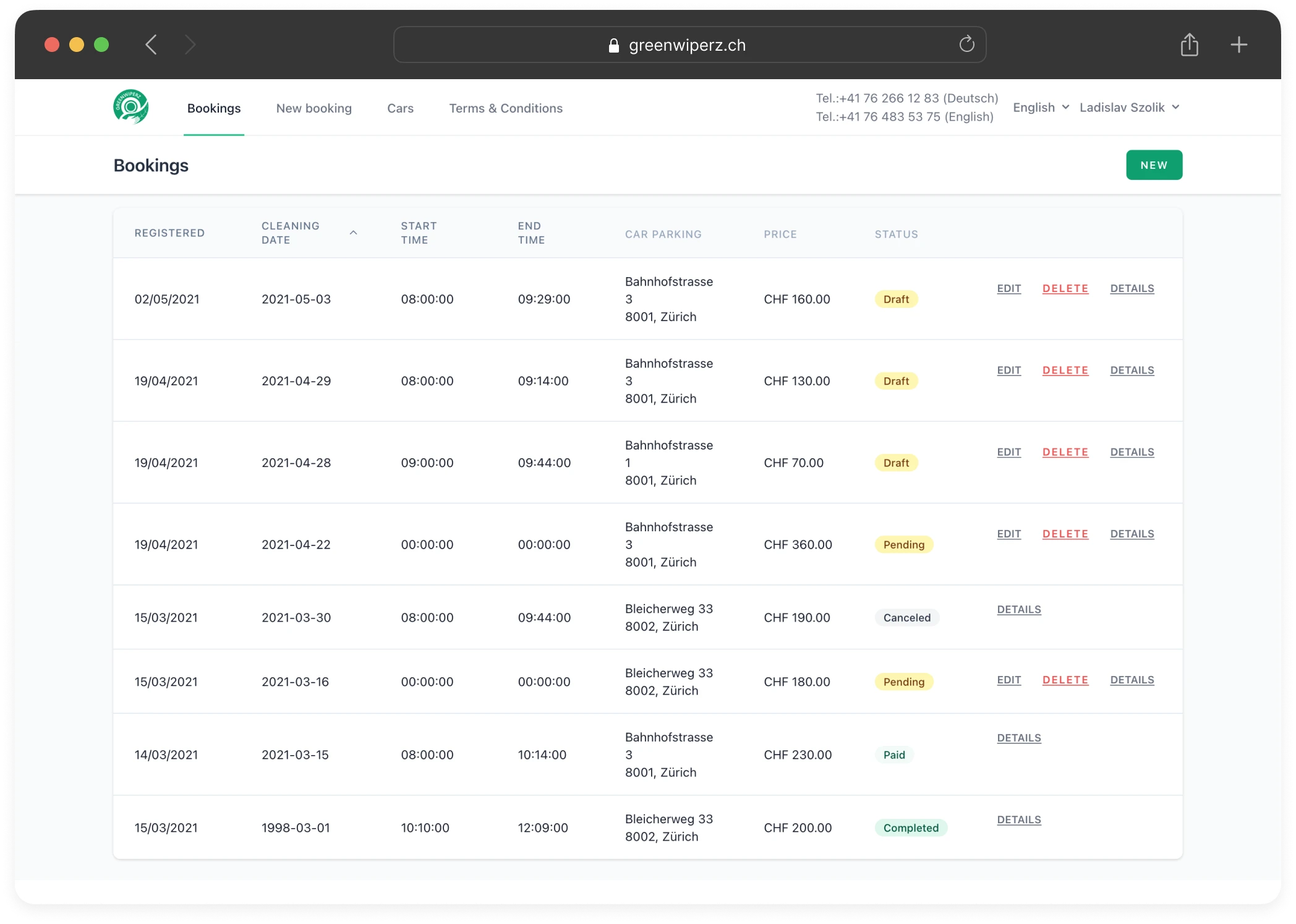
Once the form was filled out and the payment had been made, showing all bookings was an easy task. We conducted 3–4 rounds of usability testing to fine-tune which columns and actions should be visible.
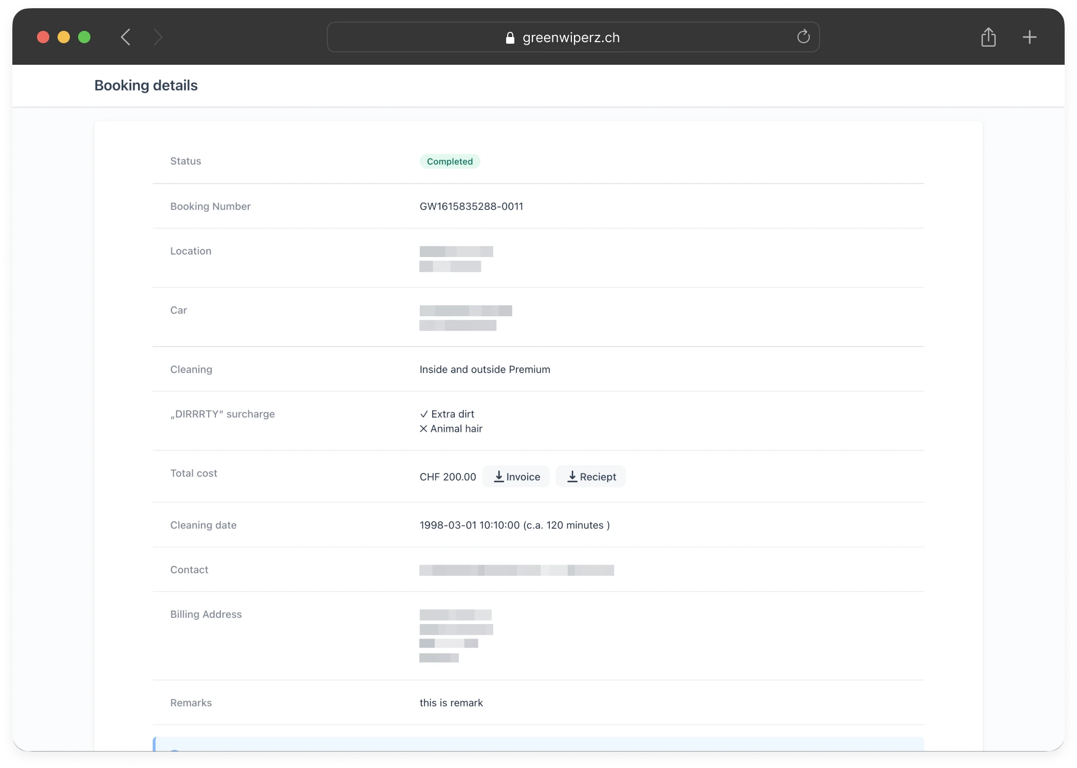
Lastly, on the booking details view, I've included PDF exports and cancellation. The challenge here was with their business rule. They defined four different time points for cancellation. Even airlines don't have that complexity...
Responsive design
One critical requirement was to support mobile screens. Throughout the development, we made sure the app remained easy to use and clear, even on small screens. For example, the bookings list is displayed in card view instead of table view.
Results
Developing such a complex solution with email notifications, payments, etc. was a great learning experience. The application has been successfully shipped and serves the clients of the startup company.
