Introduction
Timeline. Jan 2019 - Jun 2020
Problem statement. The mobile banking app for iOS an Android was a hybrid application with low performance and with few features. Because of that, the app had low rating in AppStore as well as PlayStore.
Goal. Reimagine and design a modern mobile banking experience.
Team. 4 native iOS developers, 3 native Android developers, a business analyst, a scrum master and a product owner.
Roles played. I worked with 2 senior UX designers to research and design the concept. During the implementation I was integrated into the mobile development team. The team was based in Zürich and India.
Activities
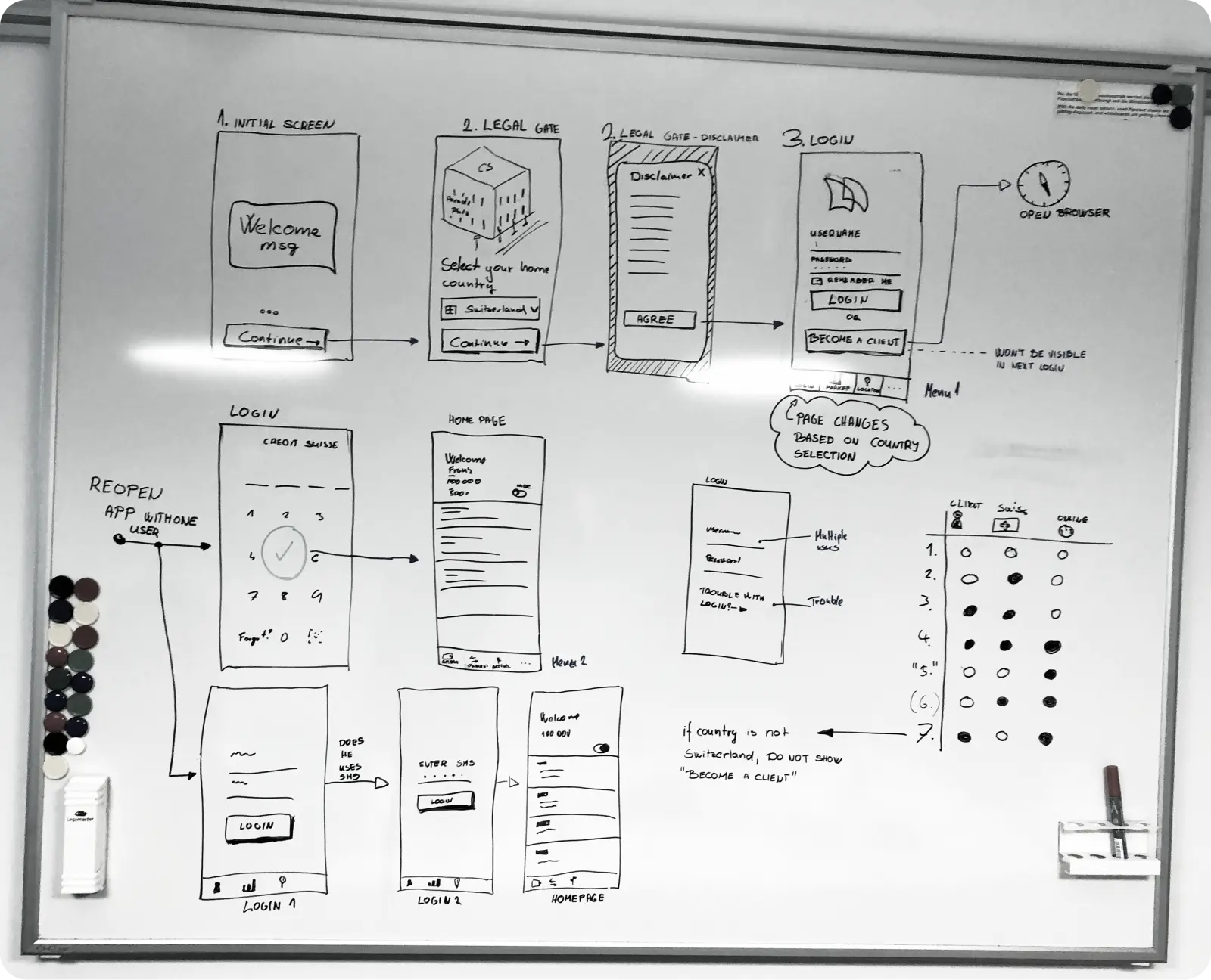
Getting started
Challenges
- The project had a large number of stakeholder with different interests.
- We had no clear idea about our target audience and their unmet needs.
- The new concept was constrained by the old backend.
Proposed solutions
- We invited stakeholders to a series of workshops where they shared and voted for ideas. Those ideas served as the first hypothesises about the app. Later, thanks to the workshops, we created a common vision.
- To clarify who is our primary audience, we interviewed stakeholders and customer facing colleagues.
- Also, we checked in the database which customers use mobile banking and what do they have in common. Lastly, we conducted two focus groups. Combining findings from all sources, we were able to define our target user and her most important goals:
- Check how much money I have?
- What were my latest transactions?
- I need to pay this bill.
- We talked with engineers early to understand what data is available and what are possible changes they can make. Unfortunately, we needed to discard few ideas at the beginning due to technical limitations.
Lessons learned
The beginning was very chaotic, but we needed to accept this and trust the process. We learned to keep stakeholders in the loop, in exchange they were helping to push the concept further.
Previous version
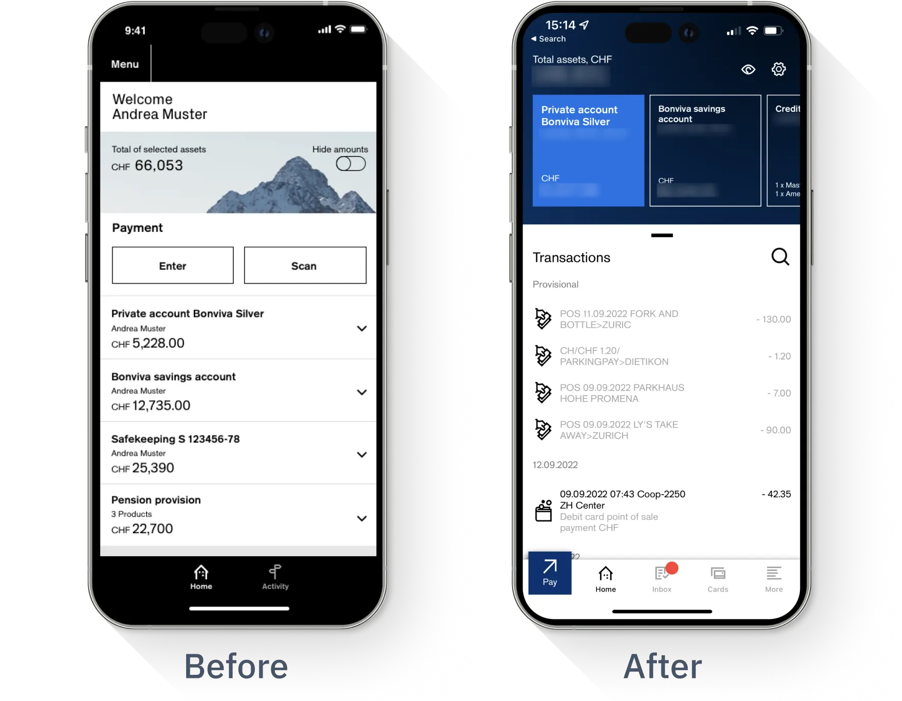
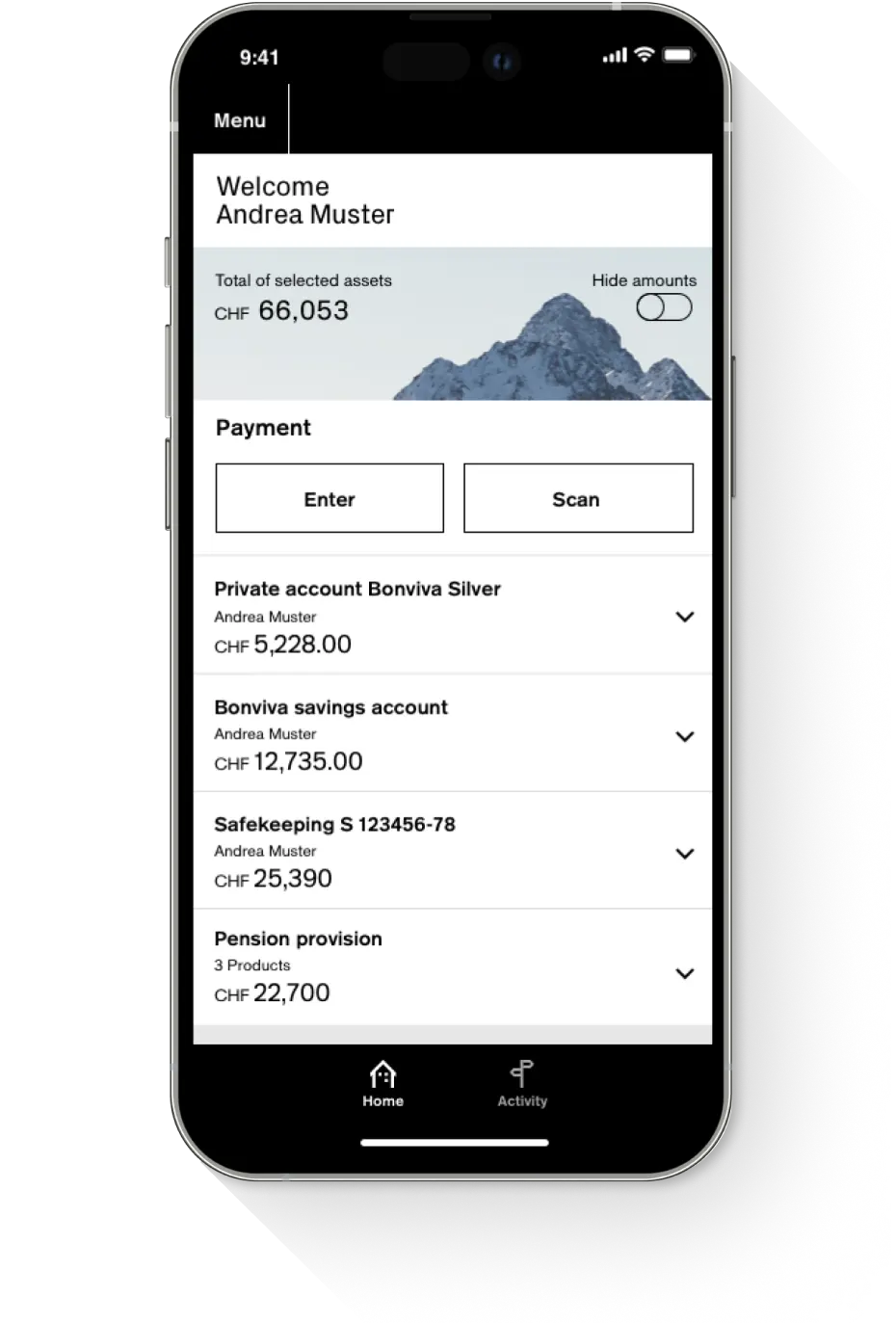
The version before the lunch of the new app was a hybrid application, it was a responsive website packed into an app. In certain scenarios this solution can work, however for a mobile banking app competing with many other apps it was not an option. This hybrid solution had many limitations. There was a delay once the user tapped on the screen. Native bottom navigation could not be used. More modern interaction pattern like swiping were not fluent. When users wanted to check whether a transaction was made they needed to expand an accordion and go to another page and scroll. Once they navigated back, the whole site reloaded, making the application feel slow. Apart from performance and usability challenges, there was negative feedback on the branding. For the users the black and white was very sad and depressing.
Early design
We wanted to set an ambitious vision for the app, therefore we went far away from the current version. The visual language was moderner and brighter. The interactions were fluid, the information kept at minimum.
Lessons learned
This concept was made interactive by Origami Studio. It motivated the team and gave them the feeling of working on something great and exceptional. However, we needed adapt the design as the data was missing and the visual design was far from our current branding. Additionally, logos and profile pictures showed legal and technical concerns.
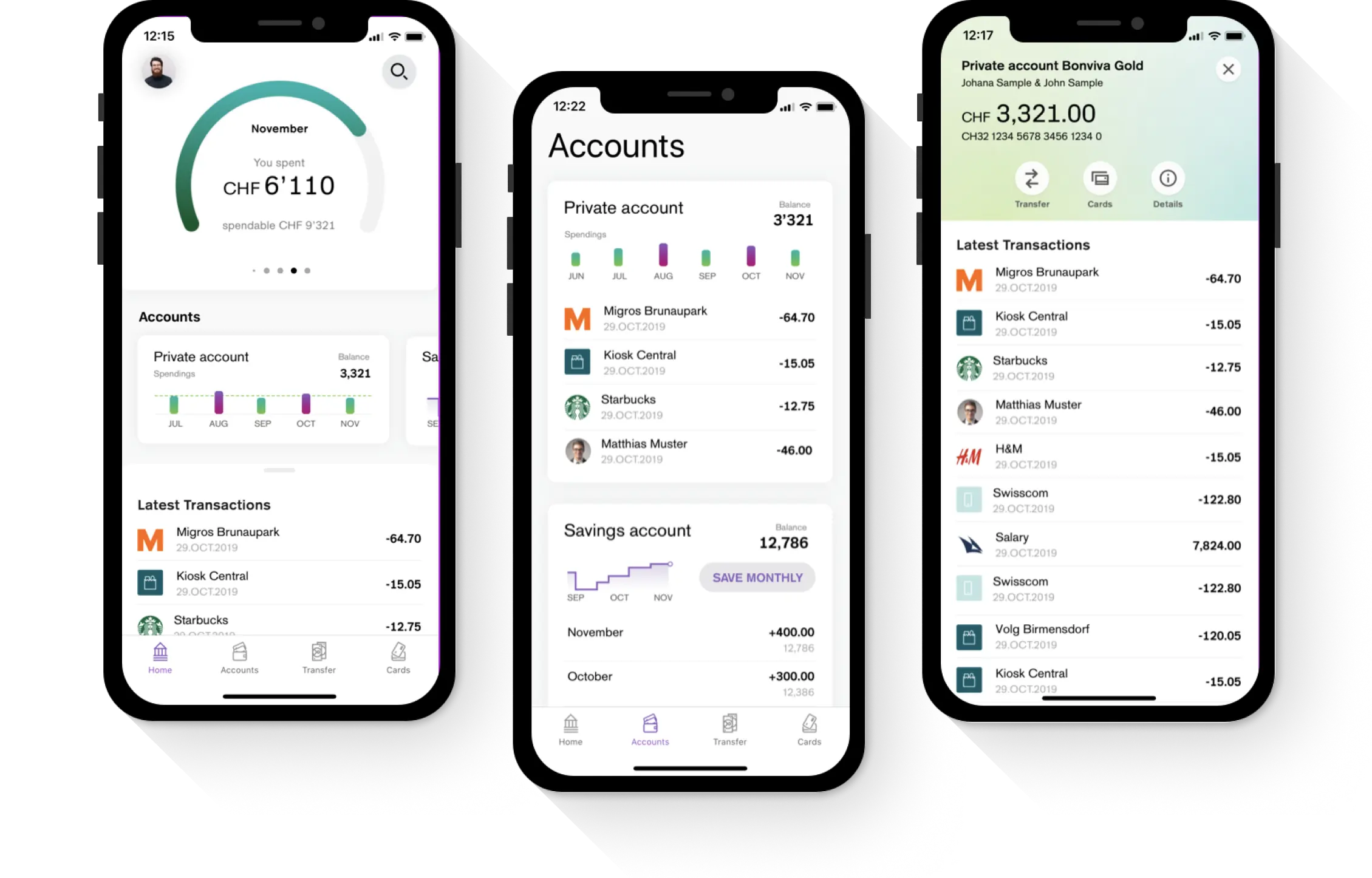
Final design
As a result of branding decision blue has become the main colour, and it was not allowed to use shadows or border radius. We accepted this constrains and use it to design the final version.
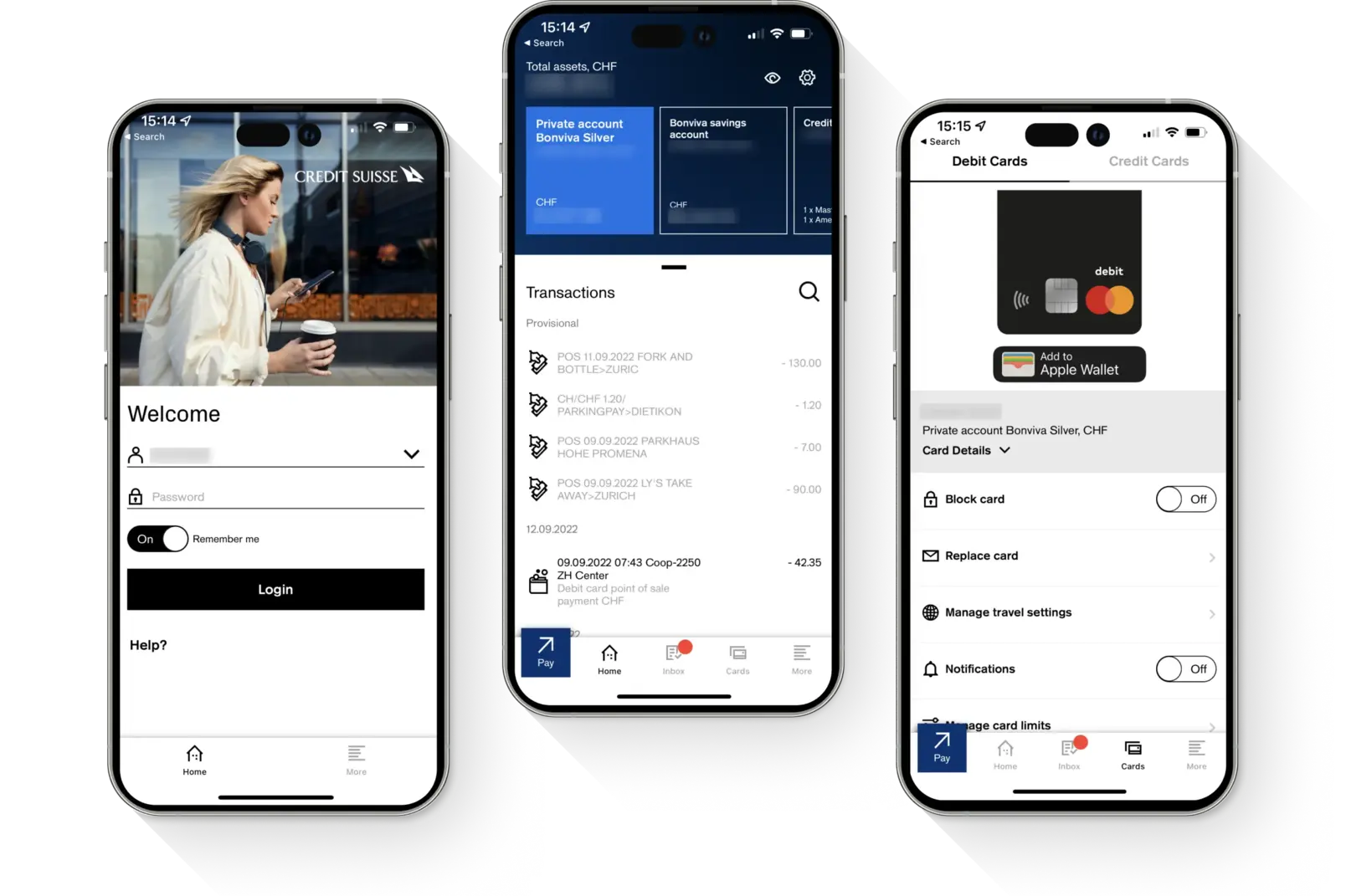
The new home page is native, therefore we could use fluent swipe gestures to speed up user navigation. For example, the user can quickly scroll horizontally to check how much money she or he has on her or his accounts. Other example is swiping up the transactions list and continue scrolling. This pattern was borrowed from Apple and Google Maps.
In summary, the top section of the home page answers the question: how much money I have? The middle section helps to find a transaction made or received. Finally, at the bottom we placed actions like pay and showing debit and credit cards.