
Introduction
Timeline: Apr 2018 - Jun 2019
Problem statement: Over 80% of the online banking usage is related to payments. However, this module faced the several challenges:
- Costly maintenance due to two separated portals for private and business clients
- Advanced features like recurring payments and templates were not used
- High number of not submitted payments, which caused delayed payments
- High number of duplicate payments, which resulted in a loss of client’s money
- Above average support calls related to payment issues
Goal: Provide for private and business clients a unified and improved experience. Resolve the above-mentioned major usability issues.
Team: Developers (on-, offshore), business analysts, product owner, scrum master, product managers and customer support.
Roles played: As a lead UX designer I was responsible for the overall payments experience.
Activities
- Interaction design (Sketch)
- Prototyping (InVision)
- IT hand-offs
- Usability testing
- Design thinking workshops
- Stakeholder management
Getting started
Challenges
The two payments portals for private and business users, have evolved over the years, and we noticed a change resistance from the product team side. The first challenge was to understand the stakeholders’ view. Secondly, we needed to bring all private and business stakeholders together and build a common vision for the new payments’ module.
Proposed solutions
We conducted interviews with stakeholders and knowledge transfer sessions with a subject-matter expert. Then, we created a list of features which they want to keep and the features they are open to change. Later, we run a series of design thinking workshops to build a vision.

Lessons learned
To fulfil every stakeholder’s requirement is difficult. Workshops helped us to align everyone, additionally we created the “we are in this together” mindset, which improved our collaboration.
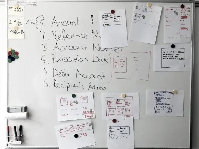
Designing the payment entry flows
Previous version
After the research phase, we started preparing designs for payment entry flows of domestic, international, red, orange and later QR payments. From production database, stakeholders and customer support we learned about existing pain points of the current solution:

- Users did not see the standing order feature.
- The account section was not clear enough and clients used the wrong account while making payments.
- Duplicate and incomplete payments, as users did not notice the end of payment flow.
Final design
We designed the new payment entries using the new corporate brand, which in this case meant changing from turquoise to black. The entry flows were tested over 16 private and 8 business users.

- Duplicate & incomplete payments were fixed after we introduced a wizard, which helped users to orient and know when payments are submitted
- Instead of showing all accounts, we went back to a simple solution, and used a dropdown instead
- Standing order was placed at users’ blind spot. We integrated it in the screen, close to the execution date
Results
- Hotlines reported decrease in recurring payment related calls.
- Production database showed decrease in double and abandon payments.
Designing the assistant
Previous version
Switzerland has a complex payment system even for private clients. Because of this complexity the bank introduced an assistant to help them.
Unfortunately, this feature brought another layer of confusion. The product team gave up solving this challenge and provided a YouTube video as explanation.

- The autocomplete for IBANs had many bugs and lead to wrong payment types.
- Business users wanted a quick way to select payment type, e.g. international payment.
- Business users were missing information from the payment list
Early designs
We wanted to simplify the assistant as much as possible and come up with a very visual concept:
- We wanted to show payment types only, when the user selects the input field
- We used logos, icons and images of people to make the assistant more visual.
Lessons learned
Payment assistant is used mainly by professional users. It does not mean only business, but also private users. After usability testings and interviews we learned the importance of certain information, which we wanted to erase. We had also technical limitation with the logos, icons and pictures. We could not use them.
Final design
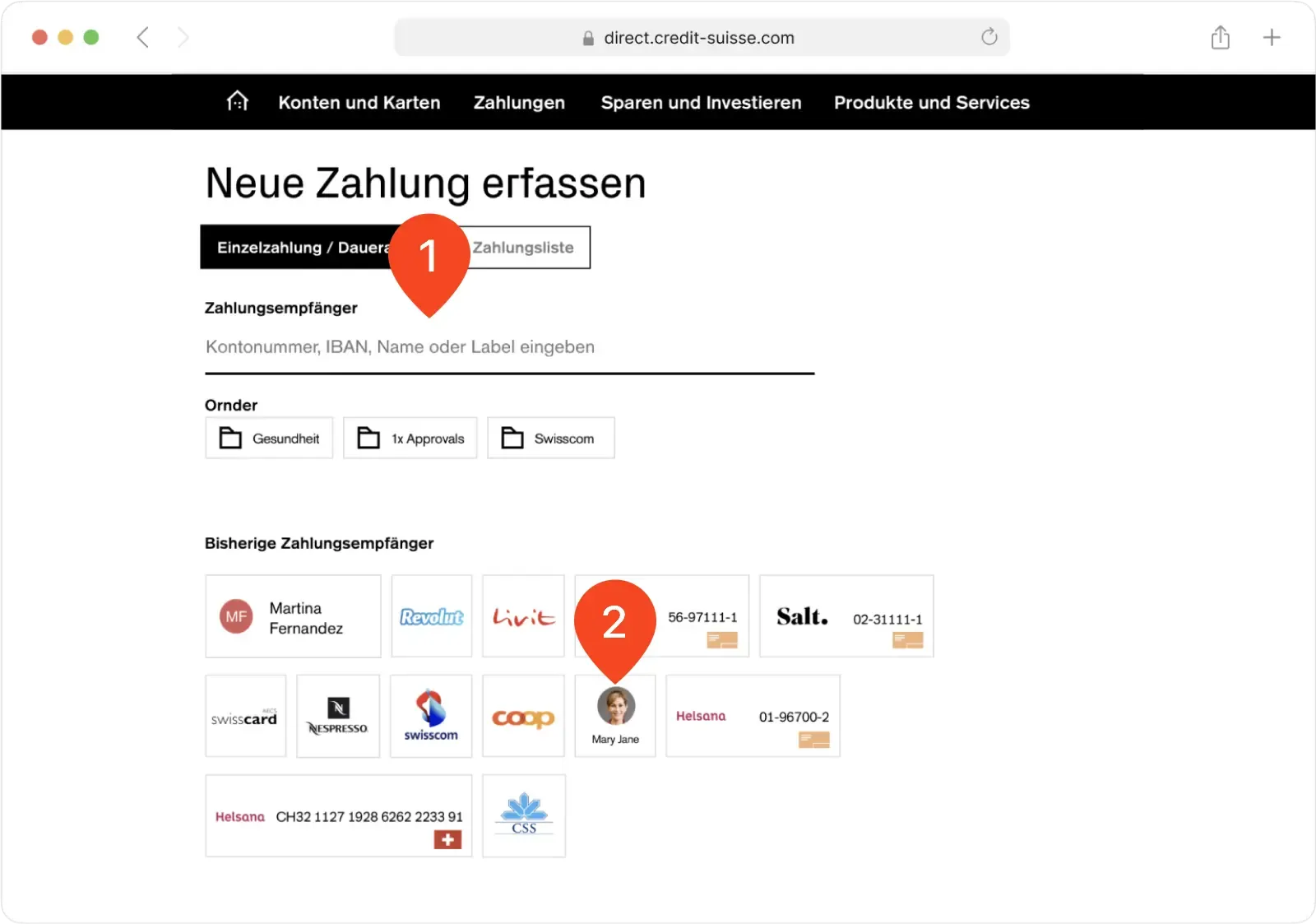
User interviews revealed that we cannot simply distinguish between private and business, instead basic and professional users. This resulted in payment screens with variants for both types. The example below shows the payment assistant final concept for professional users:
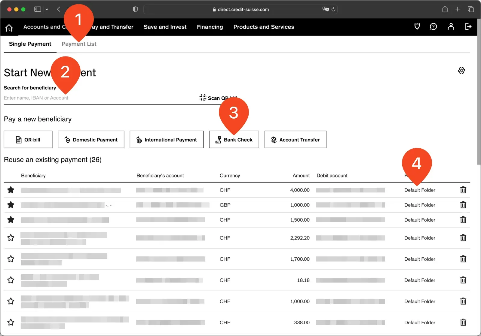
- User can enter single payment or even a list of payments.
- We kept the autocomplete with fixed usability bugs.
- All the payment types are now visible
- Expanded the list with Beneficiary’s account and folder information.
Results
After the release of the new payment assistant we received from customer support and as well from our business clients positive feedback.