Introduction
Timeline: Jun 2018 - Oct 2021
Problem statement: The design guidelines provided by the branding team were focused on print and marketing sites. They missed many application related aspects. As a result designers and developers invented their own guides and the application wasn’t consistent and had poor usability.
Goal: Define a common design language for mobile and web, so that teams become more efficient and they achieve higher level of consistency.
Team: 3 developers, 1 brand designer, 2 UX designers
Roles played: Me and another senior UX designer were responsible to define and approve each part of the design system.
Activities
- Visual design (Sketch)
- Interaction design (Sketch)
- Prototyping (InVision, Origami Studio)
- IT hand-offs
- Usability testing
- Stakeholder management
Getting started
Challenges
First we needed to find out who everyone will consume this system. Secondly, we wanted to know what format would be the best for them.
Proposed solutions
- We organised a kick-off with all the teams working on the web and mobile banking app. These teams were our target audience.
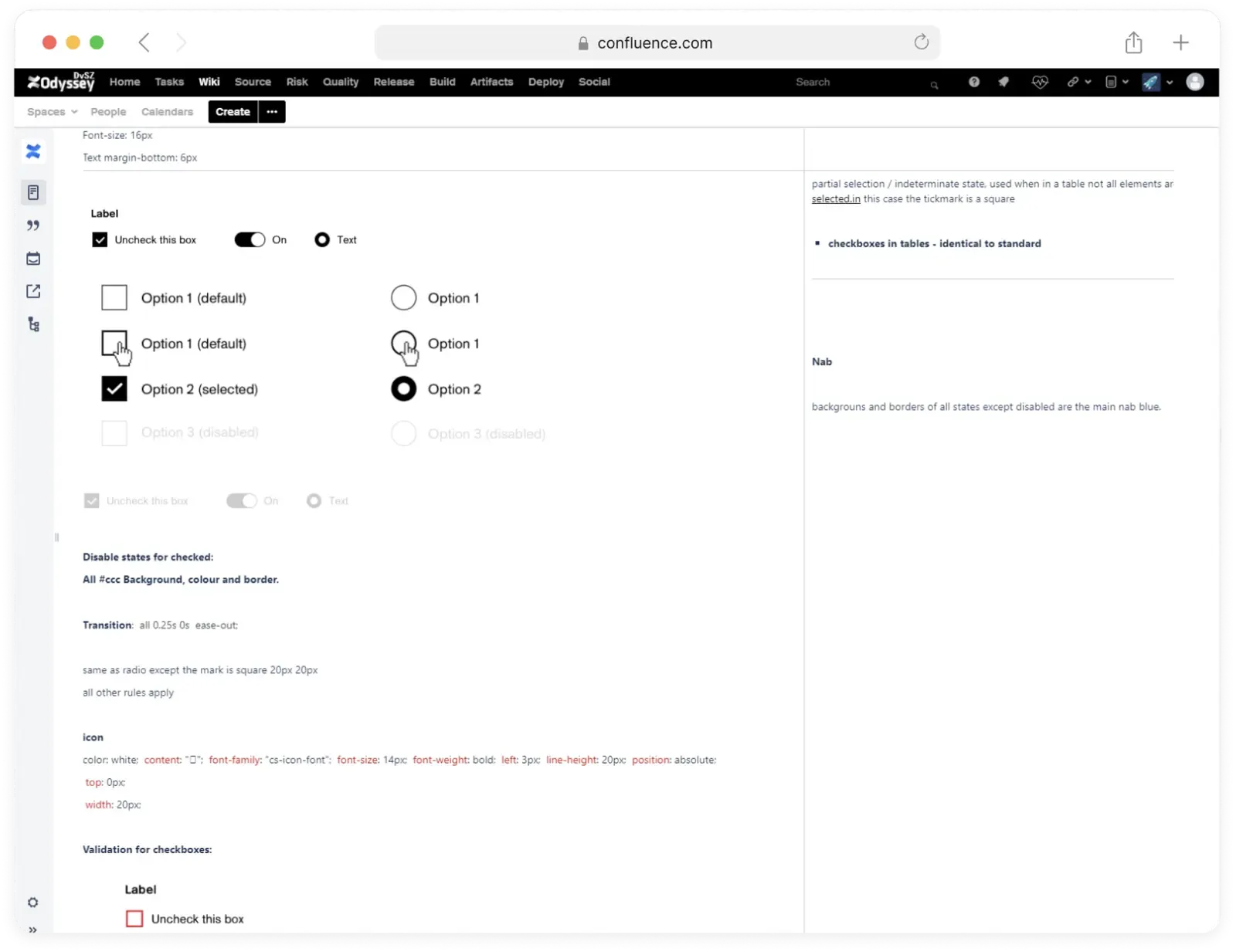
- Next, we created the first design system in Confluence. It was a huge design table, consist of categories, sub-categories, print screens and measurements.
- Confluence is accessible for everyone, no special permissions were required. At that time it was not possible to share Sketch files, so first we documented only the elements, which were required for the development team.

Lessons learned
The table was adapted by the teams due to its simplicity and easy of access. But as the content grew, it became difficult to maintain and navigate with in. We knew we needed a better solution. Using Confluence as an MVP helped us to quickly learn what information is important for the engineers.
Designing the system
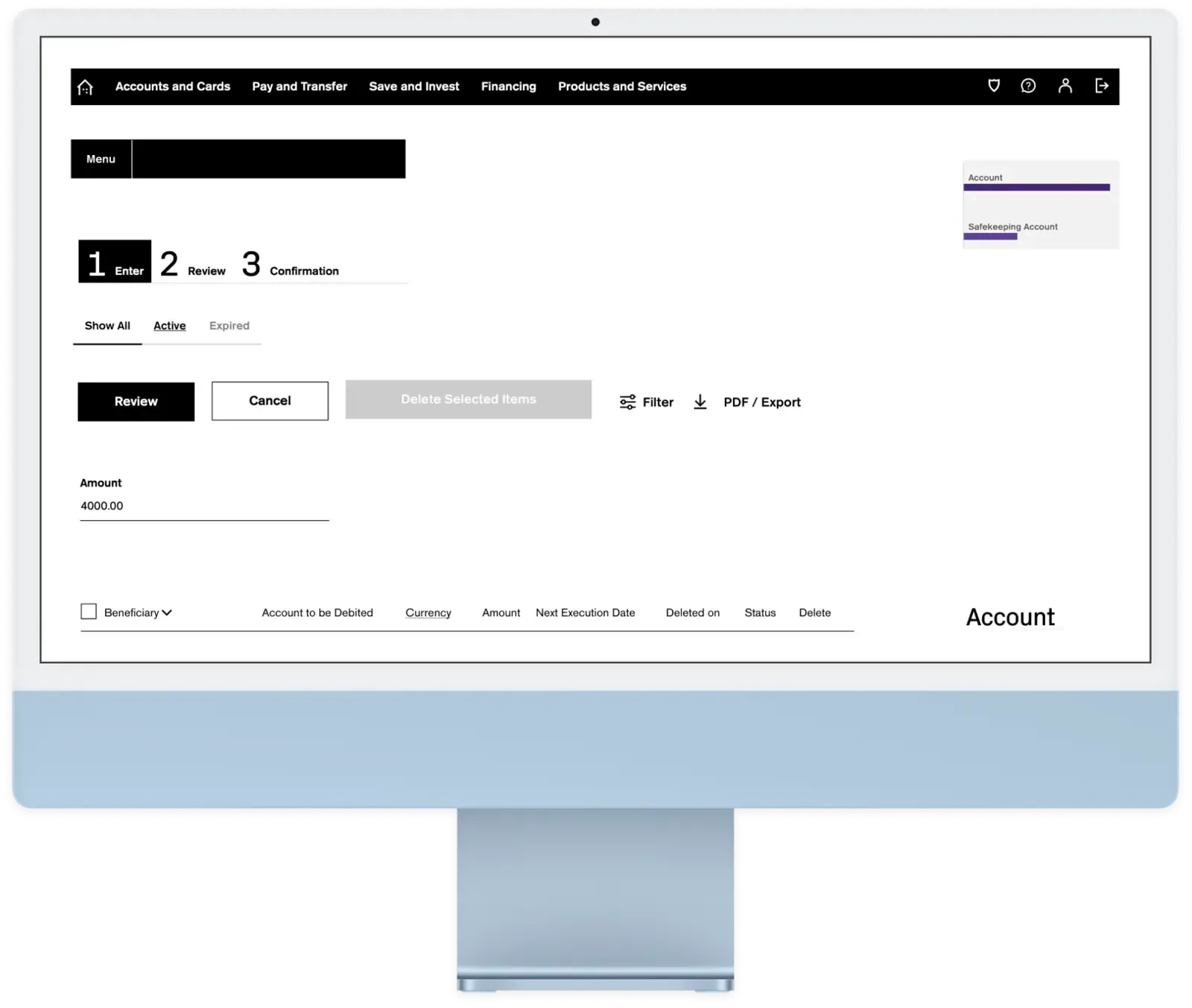
- We learned that our primary users are designers and developers. For designers we built a UI Library in Sketch.
- Developers needed interactive examples with code snippets. With the collaboration of another development team, we built a component library. This library was shared as a software package for developers, we wanted that each project integrates it and use it.
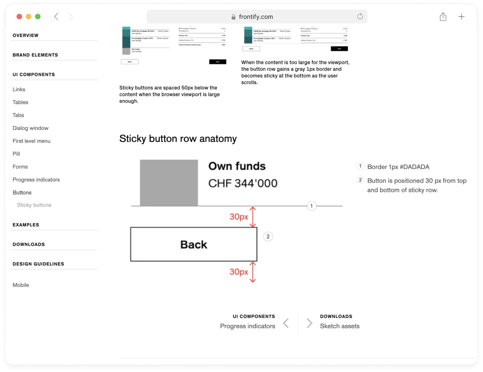
- To look up a component with its measures and context of use, we migrated the Confluence table to Frontify. It was easier to update design examples and share additional comments.

SketchApp UI libraries worked for us perfectly. Plus, we found that the interactive UI library benefits not only the developers, but the junior designers as they can observe and study certain interactions.
Results
- The design system has been successfully adapted by the teams. We introduced a weekly meeting to discuss new components and make further improvements. These recurring meetings keep the system up to date and useful.
- The online banking supports 4 languages and we lose a lot of time with prototype translations. Therefore the next step is to create a system, which allows designers to quickly prototype in multiple languages.
